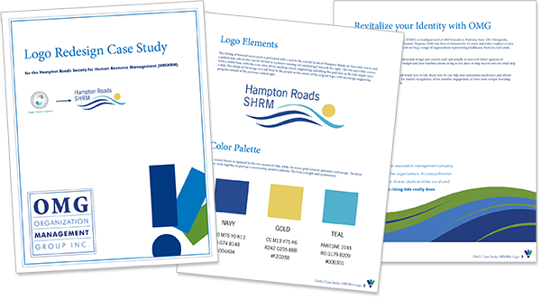
Identity and branding are crucial to a successful business, and sometimes difficult to get right. Your logo may be the first thing someone sees and if it doesn’t tell them who you are, quickly and succinctly, their gaze may just continue on to the next shiny thing. Associations face unique challenges when it comes to designing, or in this case, redesigning their logo, as a recently published case study on one of OMG’s clients demonstrates.
Working with a client to build their identity is a privilege and, as far as OMG’s designers are concerned, a lot of fun! We take the responsibility seriously but truly enjoy talking with volunteers to discover how they see their own association, and how they’d like it to be seen by potential members and other industry professionals. Applying sound graphics principles and working through ideas from all involved parties, OMG’s team is ever striving to solve visual problems and reach positive outcomes. We want to tell your story and set you up for success.
Get to know our marketing and communications staff, and if you’re ready for a rebrand, give us a call!
In late 2017, their leadership decided it was time to modernize HRSHRM’s identity. The old logo was not only difficult to read at small sizes in modern, digital environments, but the original design files had been lost prior to OMG’s management, forcing volunteers to use low-resolution copies and making updates nearly impossible. The challenge set before OMG was two-fold; first, come up with a design that was clean, clear, and reflective of the group’s values, and second, to adhere to the very strict guidelines set forth by SHRM national for chapter logos.Many associations are chapters of a larger group; sometimes that regional or national organization has a clearly defined brand, and provides chapters with everything they need. More often than not, chapters are left to interpret the brand on their own. In this instance, we had the autonomy to create a unique identifier for the local chapter (our client), but it had to play by a very precise set of rules from national.
Working with a client to build their identity is a privilege and, as far as OMG’s designers are concerned, a lot of fun! We take the responsibility seriously but truly enjoy talking with volunteers to discover how they see their own association, and how they’d like it to be seen by potential members and other industry professionals. Applying sound graphics principles and working through ideas from all involved parties, OMG’s team is ever striving to solve visual problems and reach positive outcomes. We want to tell your story and set you up for success.
Get to know our marketing and communications staff, and if you’re ready for a rebrand, give us a call!


